Why choose a human graphic designer in the age of artificial intelligence?
Today, in just a few clicks, anyone can generate a logo using artificial intelligence. It's fast, practical, and sometimes even impressive... on the surface.
But a successful logo isn't just a pretty or symmetrical image. It's a meaningful visual identity, a strategic tool that conveys your values, your positioning, and your personality.
Where AI simply combines shapes and colors according to pre-programmed algorithms, a human graphic designer takes the time to understand who you are, what you do, and who you're talking to. They detect nuances, question what you really want to express, and create a tailor-made creation—not just another variation among thousands of others.
Choosing a graphic designer means choosing to listen, reflect, use intuition, and be creative. It means choosing a design designed to last, make an impression, and tell a story: yours.
🧭 A concrete experience, step by step
On this page, I invite you to discover a client's real-life journey in creating their logo.
A three-step process that perfectly illustrates the difference between an automated rendering... and a custom, human-made creation.
1. Step 1 – The starting point:
The client first designed a logo themselves, using a basic tool like Paint. A rough but honest first sketch.
2. Step 2 – The AI alternative:
They then sent this first version to an artificial intelligence (AI) to obtain a cleaner, more modern rendering, hoping to improve visual quality.
3. Step 3 – The human approach:
Finally, they contacted me with both proposals (their own and the AI's).
Using the same brief, I took everything from scratch to offer them a professional, coherent logo that truly aligned with their brand image.
Step 1 – The starting point:
The client wanted to create a logo for their future restaurant, with a strong and recognizable identity around a single theme: Belgium.
They wanted a simple yet impactful logo that immediately evoked Belgian culture, whether through colors, shapes, or symbols.
The client's brief: a Belgian-themed restaurant
Their objective was clear:
> Convey a warm, friendly, and authentic Belgian atmosphere from the very first glance—without resorting to clichés.
with Paint
Based on these specifications, they initially attempted to create the logo themselves...
Step 2 – Alternative AI:
He then passed this first version to an artificial intelligence (AI) for a cleaner, more modern rendering, hoping to improve visual quality.
Their objective was clear:
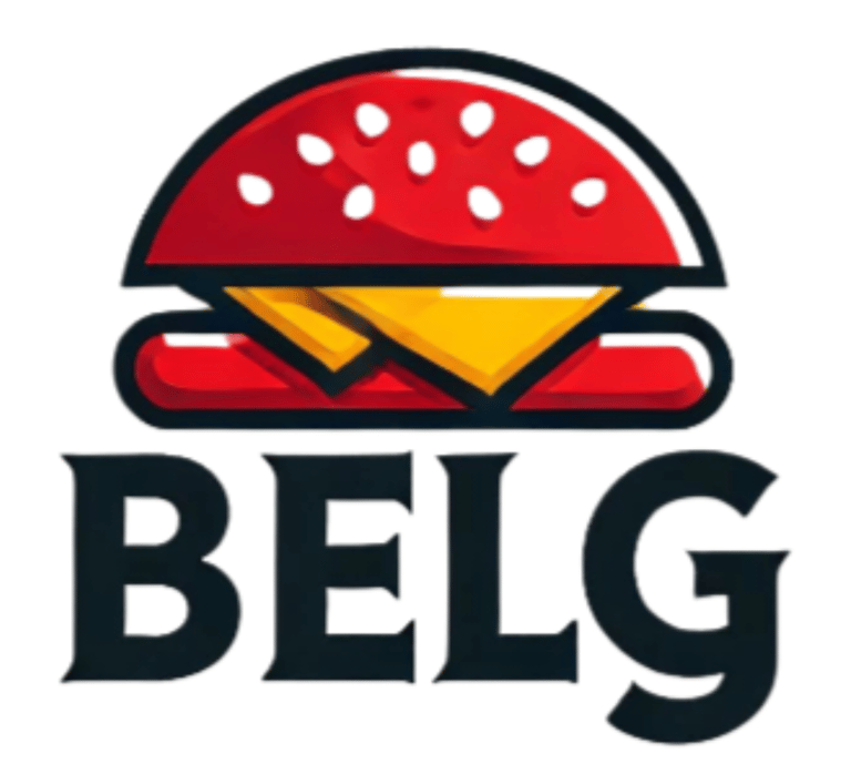
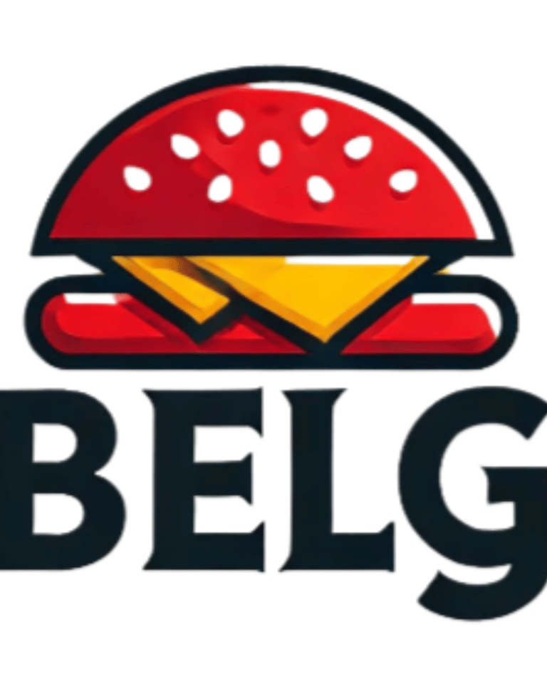
In just a few seconds, the AI produced a cleaner, more centered version with bolder colors.
Yes, the result is visually clean: the burger is symmetrical, the elements are well aligned, and the whole thing looks more "modern."
But in reality, it's just a reworked copy.
👉 The AI didn't redesign anything: it simply reinforced what already existed. The logo remains rigid, without nuance, with generic typography. The cheese is still there, but without perspective, graphic play, or strong intention. The composition lacks soul, depth, and visual storytelling.
Step 3 – What I created from the same brief
Rather than simply "reproducing more accurately," I took the client's specifications and took the time to analyze them in depth. I questioned their intentions, studied their needs, and proposed a strong, coherent, and tailor-made brand vision.
The result: a modern, elegant, meaningful logo... and deeply Belgian.
I redesigned the typography to evoke indulgence, roundness, and character. The looped "g" brings visual dynamics while also nodding to the culinary world.
The crown on the "e" incorporates a fleur-de-lis, a symbol of elegance, nobility, and heritage. This discreet yet powerful detail reinforces the brand's historical and premium dimension.
The word “GOURMET,” in white capital letters, contrasts with the yellow of “Belg,” to clearly assert the brand's premium positioning.
And finally, I incorporated the black, yellow, and red tricolor stripe—a simple and effective way to recall the brand's Belgian roots, without falling into cliché.
👉 My goal wasn't simply to create a beautiful visual. I wanted to create an identity.
Where artificial intelligence applies rules, I tell a story.